
Responsive Web Site Development
Responsive Web Site Development Services
Our Responsive Web Site Development services focus on performance optimization, modern UI/UX design, cross-browser compatibility, and scalable architecture that supports business expansion.
Our Responsive Web Site Development services focus on creating high-performance websites that deliver smooth browsing experiences across all devices. Our development team specializes in responsive frameworks, mobile-first architecture, and SEO-optimized structures that improve Google rankings and user engagement.
Responsive Web Site Development improves bounce rate, increases dwell time, and enhances conversion optimization. Search engines prioritize mobile-friendly websites, making responsive design essential for long-term SEO success.
Responsive Web Site Development Company In Pune
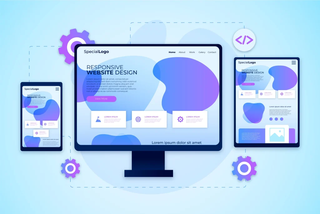
Understanding business objectives, customer intent, competitor strategies, and device usage trends helps create a responsive website structure aligned with SEO requirements, user expectations, and conversion-focused digital growth strategies.
Business Goal Analysis & Market Research
Creating a responsive wireframe ensures proper layout hierarchy for mobile, tablet, and desktop screens, improving navigation flow, readability, user engagement, and structured content presentation across multiple device resolutions.
Responsive Wireframe & Structure Planning
UI/UX design focuses on flexible grids, scalable typography, adaptive images, and brand consistency to deliver visually appealing interfaces that enhance usability, engagement, trust, and responsive experience across devices.
Modern UI/UX Responsive Design
Developers use responsive frameworks like Bootstrap, Tailwind CSS, and media queries to build flexible layouts that automatically adjust screen sizes, ensuring consistent performance, accessibility, and cross-device compatibility.
Frontend Responsive Coding Implementation
Performance optimization includes compressed images, lazy loading, optimized scripts, browser caching, and minified CSS to improve page speed, Core Web Vitals, SEO rankings, and mobile-friendly performance efficiency.
Website Speed & Performance Optimization
Testing ensures consistent functionality across Chrome, Safari, Firefox, Edge, Android, iOS, and tablets, validating responsive behavior, layout stability, performance accuracy, and smooth user experience on all devices.
Cross-Browser & Multi-Device Testing
Core Process of Professional Responsive Website Development
Best Responsive Web Site Development Services in India
India has become a major hub for responsive website development, offering cost-effective solutions combined with advanced technology expertise. Professional Responsive Web Site Development services in India focus on delivering mobile-friendly, SEO-optimized, and performance-driven websites suitable for global audiences.
Responsive Web Site Development improves search engine visibility because Google prioritizes mobile-friendly websites in rankings. According to industry research, mobile usability directly influences ranking signals and user engagement metrics.

Must-Have Features for A Successful Responsive Website Launch
Mobile-First Responsive Design – Responsive Web Site Development prioritizes mobile-first structure, ensuring fast performance, clean layout, improved usability, better SEO rankings, and seamless scaling across larger screen devices.
Flexible Layout Grid System – Flexible grid layouts automatically adjust content width, alignment, and spacing to maintain structured design, readability, and consistent visual appearance across all device resolutions.
Fast Loading Website Performance – Optimized images, minimized scripts, browser caching, and CDN integration significantly improve page speed, enhance user experience, and support better SEO ranking performance.
SEO-Optimized Website Structure – Structured HTML tags, schema markup, optimized meta titles, and clean code improve search visibility, indexing efficiency, and help Responsive Web Site Development rank higher.
Cross-Browser Compatibility Testing – Responsive websites ensure consistent functionality and appearance across Chrome, Safari, Firefox, Edge, and Opera, delivering smooth performance and reliable user experience everywhere.
Conversion-Focused User Experience – Strategic call-to-action buttons, responsive forms, and optimized landing page layouts improve engagement, generate quality leads, and increase overall website conversion rates effectively.

Step-by-Step Process for High-Quality Responsive Website Development
We evaluate business goals, audience behavior, competitors, and industry trends to build a responsive website strategy focused on performance, scalability, SEO growth, and long-term digital success.
Business Requirement & Strategy Planning
Interactive wireframes and responsive design prototypes help visualize layout structure, content hierarchy, and adaptability across mobile, tablet, and desktop screens be.fore development begins.
Wireframe & Prototype Creation
Developers implement clean responsive coding, flexible frameworks, optimized images, and structured layouts to ensure fast loading speed, scalability, device adaptability, and consistent website performance.
Responsive Website Development Execution
Websites undergo speed optimization, responsiveness testing, cross-browser compatibility checks, mobile usability validation, and technical performance audits to ensure stable functionality across all devices.
Quality Testing & Performance Validation
Responsive websites are launched with optimized meta tags, structured data, XML sitemap integration, indexing configuration, and technical SEO setup to improve search engine visibility.
SEO-Friendly Website Launch Setup
Continuous monitoring, performance improvements, security updates, and responsive enhancements ensure long-term website efficiency, improved rankings, user engagement, and adaptation to evolving technology trends.
Ongoing Maintenance & Performance Optimization
Frequently Asked Questions?
Responsive Web Site Development is a design approach that ensures websites automatically adapt to different screen sizes, improving usability across mobile, tablet, and desktop devices.
Google prioritizes mobile-friendly websites in rankings. Responsive websites improve page speed, reduce bounce rate, and enhance user experience.
The development timeline depends on project complexity, features, and design requirements. Standard responsive websites typically take 1 – 2 weeks.
Common technologies include HTML5, CSS3, JavaScript, Bootstrap, Tailwind CSS, WordPress, and React.
Yes, responsive websites improve accessibility and user experience, leading to higher engagement and improved conversion rates.
Let's Connect
Ready to Start Your Project?
Let’s discuss how we can help bring your vision to life with our expertise.